
This project was Urban Outfitters’ first responsive site design. Collaborated closely with UX and Dev teams to ensure a successful site launch within the technical requirements and brand creative.
Design Challenge
When we started on this project, Urban Outfitters was in the process of rebranding itself by elevating the quality of products and its aesthetics to be know as a more refined brand. As part of this rebranding strategy, I was tasked to create a new design system as well as UI kit and style guide for redesigning the site, while ensuring a simple, intuitive, and consistent experience throughout.
Responsibilities
- Translate the elevated brand experience through UI/UX design.
- Create design system and UI style guide
- Refine overall UI/UX to create a better shopping experience
- Improve conversion rates
- Introduce user-generated content in the shopping experience
- First project working within an Agile workflow between UI, UX, and Dev
Homepage and Navigation


Design Challenge
Some of the challenge we were trying to solve for as we were redesigning our navigation were the fact large assortment of products which caused an overcrowded navigation.
As most of the customers were diving straight into the category pages, they were missing and not interacting with key marketing messages on our homepages.
Solution
- By directing customers to click into the level 1 category (Women’s, Men’s, Apartments, etc.) to see level 2 and 3 categories, it enabled us to send customers to the Gateways pages where they discovered our marketing messages.
- Breakout Nav enabled customers to more easily scan the taxonomy and to dive into the sub-category level from the navigation. This allowed customers to more easily navigate and not be overwhelmed by all of the options.
With the new navigation, there was an increase in engagement with our marketing messages, as well as the number of categories viewed per session.
Product Detail Page
Design Challenge
- Increase conversion
- Showcase newly stylized product view/details to inspire customers
- Update page layout to better communicate the information hierarchy
- Increase customer engagement and showcase the lifestyle brand
Solution
- By default we presented the customers with all 6 product detail images enabling a better viewing experience and page load times.
- Integration of user-generated content offered customers a channel to connect with other customers and to view the product in the real world.
- Increased prominence of the recommended products.
- Clean UI, allowing photography to shine.


Conversion rates increased while ATB rates went down with the update. We believe this was due to better decision-making by the customers given the increased visibility into the product.
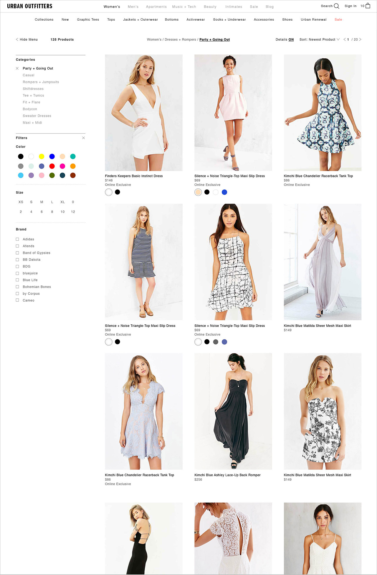
Category Page

Page layout was updated by a larger product image using a simple UI that allowed customers to more easily focus on the products. The additional features to toggle detail on/off, and to show/hide filter offered more flexibility for the merchandiser to curate the page based on their needs.
Team
Mika Osborn – Lead UI Designer, Leslie Zacharkow – UX Designer, Mike Pitone – UX Director, James Mackenzie & Namik Schwarz – Art Director, Matt Owen – Creative Director
